import matplotlib.pyplot as pltCPDS in Python Lab - Matplotlib
Matplotlib is a Python package used for data visualization. Graphs help us see trends, relationships, comparisons, distributions, and differences between observations and predictions.
The plotting module is imported as:
import matplotlib.pyplot as plt1. Importing Matplotlib
The pyplot module contains the plotting functions we will use.
Question 1
Import matplotlib.pyplot using the alias plt.
2. Line Plot
A line plot displays numerical values as points connected by line segments.
Question 2
Plot \(y=[1,4,9,16,25]\). Before running the code, predict the x-values.
y = [1,4,9,16,25]
plt.plot(y,'o-')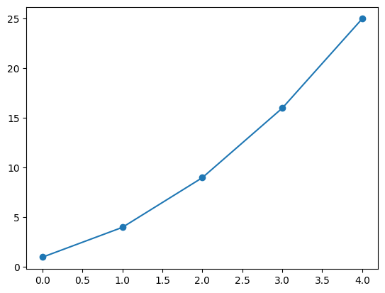
If only y is supplied to plt.plot(y), Python automatically uses the indices \(0,1,2,\ldots\) as the horizontal coordinates.
3. Plotting y Against x
Question 3
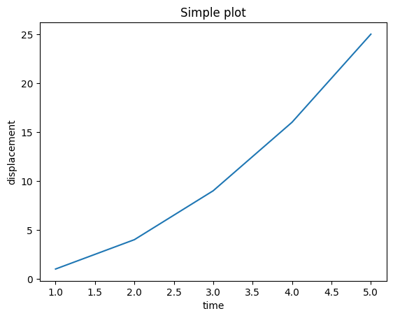
Plot \(y=[1,4,9,16,25]\) against \(x=[1,2,3,4,5]\).
x = [1,2,3,4,5]
y = [1,4,9,16,25]
plt.plot(x,y)
plt.show()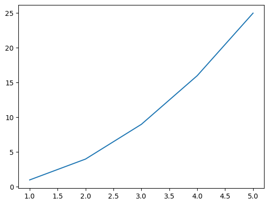
4. Labels and Titles
Question 4
Add x-axis and y-axis labels and the title "Simple Plot" to the previous graph.
plt.plot(x,y)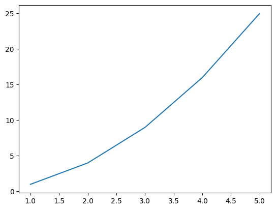
plt.plot(x,y)
plt.title("Simple plot")
Text(0.5, 1.0, 'Simple plot')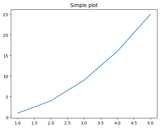
plt.plot(x,y)
plt.title("Simple plot")
plt.xlabel("time")
plt.ylabel("displacement")
plt.show()
Use plt.xlabel(), plt.ylabel() and plt.title() to explain what a graph represents.
Assignment 61 — Matplotlib Basics
- Import
matplotlib.pyplotasplt. - Plot
y = [1, 4, 9, 16, 25]. - Plot
yagainstx = [1, 2, 3, 4, 5]. - Add x-axis and y-axis labels.
- Add the title
"Simple Plot".
import matplotlib.pyplot as plt
y = [1,4,9,16,25]
x = [1,2,3,4,5]
plt.plot(x,y)
plt.title("Simple plot")
plt.xlabel("time")
plt.ylabel("displacement")
plt.show()
5. Plotting Mathematical Functions
Question 5
Generate 100 equally spaced points between 0 and 10 and plot \(y=x^2\).
import numpy as np
x = np.linspace(0,10,100)
y = x**2
plt.plot(x,y)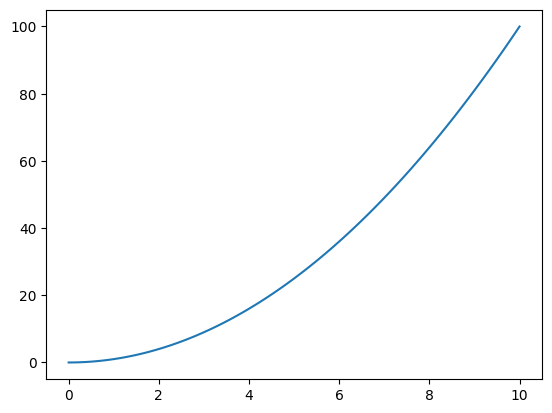
plt.plot(x,x**2)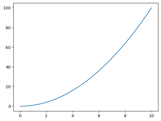
Question 6
Plot \(y=\sin(x)\) for 100 points between 0 and 10.
x = np.linspace(0,10,100)
plt.plot(x,np.sin(x))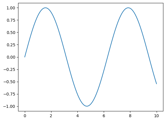
Question 7
Plot \(y=\cos(x)\) for the same interval.
x = np.linspace(0,10,100)
plt.plot(x,np.cos(x))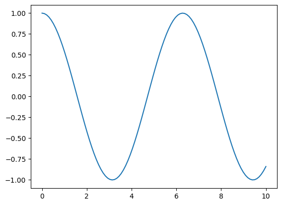
7. Multiple Curves
Question 8
Plot \(\sin(x)\) and \(\cos(x)\) on the same graph.
plt.plot(x,np.sin(x))
plt.plot(x,np.cos(x))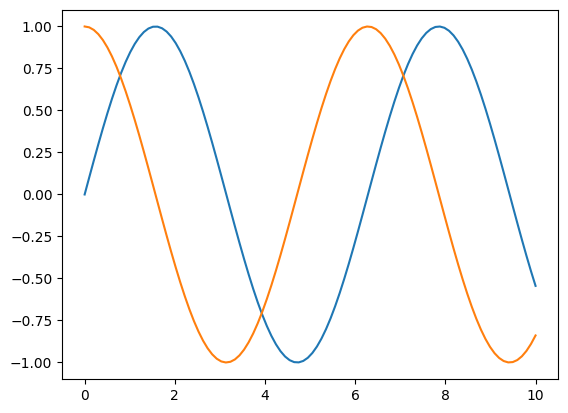
plt.plot(x,np.sin(x))
plt.show()
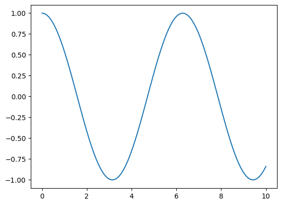
plt.plot(x,np.cos(x))
plt.show()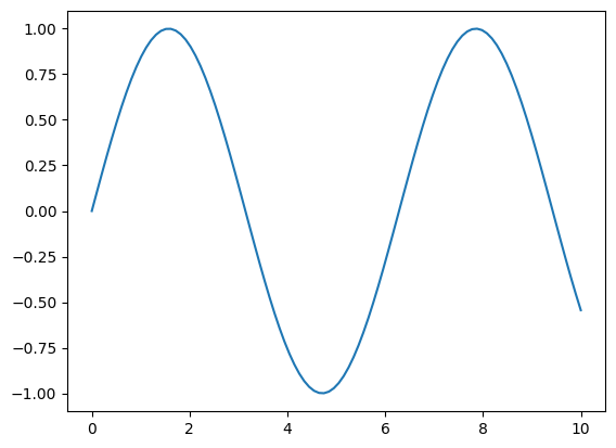
8. Legend and Grid
A legend identifies different curves.
Question 9
Add a legend and grid to the sine-cosine graph.
plt.plot(x,np.sin(x), label = "Sine")
plt.plot(x,np.cos(x), label = "Cosine")
plt.legend()
plt.show()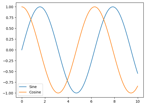
plt.plot(x,np.sin(x), label = "Sine")
plt.plot(x,np.cos(x), label = "Cosine")
plt.legend(ncols = 2)
plt.grid()
plt.show()
--------------------------------------------------------------------------- NameError Traceback (most recent call last) /tmp/ipykernel_1796/3983006052.py in <cell line: 0>() ----> 1 plt.plot(x,np.sin(x), label = "Sine") 2 plt.plot(x,np.cos(x), label = "Cosine") 3 plt.legend(ncols = 2) 4 plt.grid() 5 plt.show() NameError: name 'x' is not defined
Grid lines are added using plt.grid(True).
9. Markers and Line Styles
Question 10
Plot the experimental data below with circular markers and a dashed line.
\(x=[0,1,2,3,4,5]\), \(y=[0,2,5,9,14,20]\).
plt.plot(x,np.sin(x),'--')
plt.plot(x,np.sin(x),'*')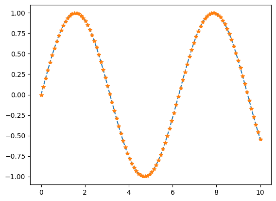
plt.plot([1,2,3,4,5,6,7,8,9],'o')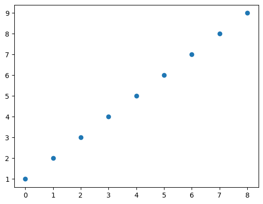
10. Scatter Plots
A scatter plot displays each observation as an individual point without joining the points. It is useful for studying relationships, correlations, clusters and outliers.
Question 11
Study hours are [1,2,3,4,5,6] and marks are [42,50,58,67,76,85]. Draw a scatter plot.
plt.scatter([1,2,3,4,5,6],[42,50,60,43,55,55])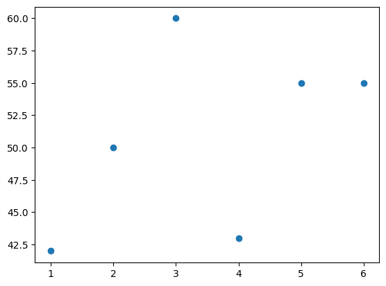
Use plt.scatter(x,y).
11. Bar Plots
A bar plot compares numerical quantities associated with different categories.
Question 13
Plot marks [92,88,90,95] for ["Math","Physics","Chemistry","Python"].
plt.bar(["Math","Physics","Chem","Py"],[92,88,90,95])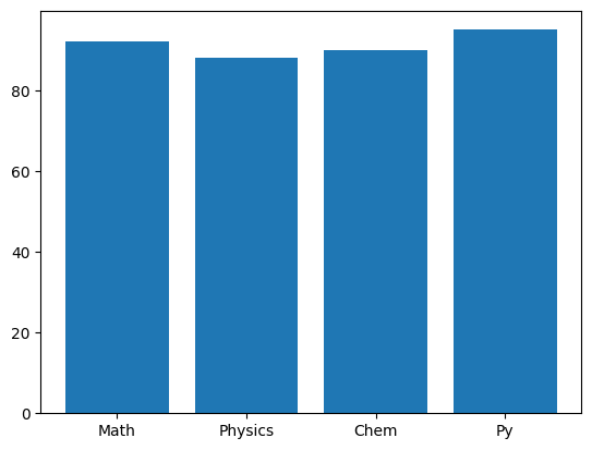
Use plt.bar(categories, values).
Assignment 64 - Bar Plot
- Store four subject names.
- Store corresponding marks.
- Create a bar plot.
- Add axis labels.
- Add a title.
sub_names = ["math", "Phy"]
sub_marks = [92,90]
plt.bar(sub_names,sub_marks)
plt.title("Marks")
plt.xlabel("Subjects")
plt.ylabel("Marks")
plt.show()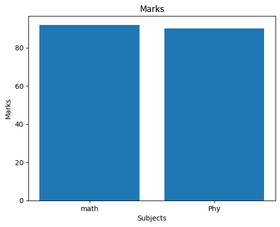
12. Horizontal Bar Plots
Question 14
Compare execution times: Euler = 2.1 s, Runge-Kutta = 4.8 s, Finite Difference = 3.5 s.
plt.barh(["Euler","RK", "FD"], [2.1,4.8,3.5])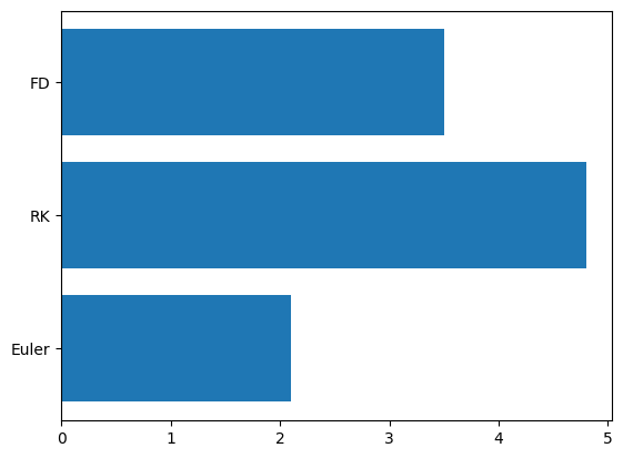
plt.barh(categories,values) produces horizontal bars and is useful when category names are long.
13. Histograms
A histogram shows the distribution of numerical data. It divides values into intervals called bins and counts how many observations fall in each interval.
Question 15
Draw a histogram of the following marks using 5 bins.
plt.hist([92,43,98])(array([1., 0., 0., 0., 0., 0., 0., 0., 1., 1.]),
array([43. , 48.5, 54. , 59.5, 65. , 70.5, 76. , 81.5, 87. , 92.5, 98. ]),
<BarContainer object of 10 artists>)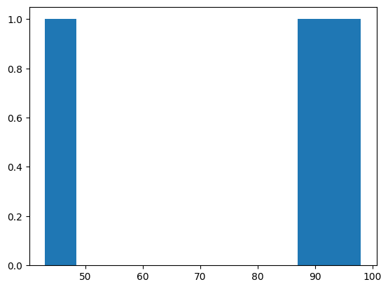
plt.hist([92,43,98], bins = 1)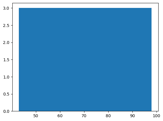
plt.hist([92,43,98], bins = 5)(array([1., 0., 0., 0., 2.]),
array([43., 54., 65., 76., 87., 98.]),
<BarContainer object of 5 artists>)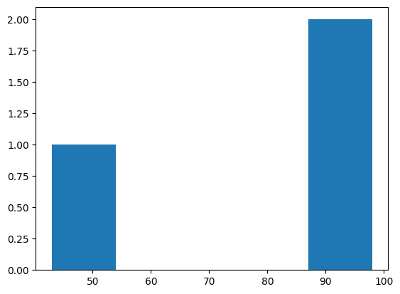
Use plt.hist(data,bins=...).
14. Why Does the Number of Bins Matter?
Few bins give a coarse view; more bins reveal finer detail. The chosen number of bins affects how we interpret a distribution.
Question 16
Display the same marks first with 4 bins and then with 10 bins.
Assignment 65 - Histogram
- Create a list of student marks.
- Draw a histogram.
- Use 5 bins.
- Label the axes.
marks = [20,19,18,15]
plt.hist(marks, bins = 5)
plt.xlabel("marks")
Text(0.5, 0, 'marks')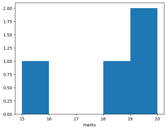
15. Multiple Mathematical Curves
Multiple curves are useful for direct comparison.
Question 17
Generate x-values from 0 to 3 and plot \(y=x\), \(y=x^2\), and \(y=x^3\) on the same graph. Add a legend and grid.
x = np.linspace(0,3,100)
plt.plot(x,x, label = "x")
plt.plot(x,x**2, label = "x^2")
plt.plot(x,x**3, label = "x^3")
plt.legend()
plt.grid()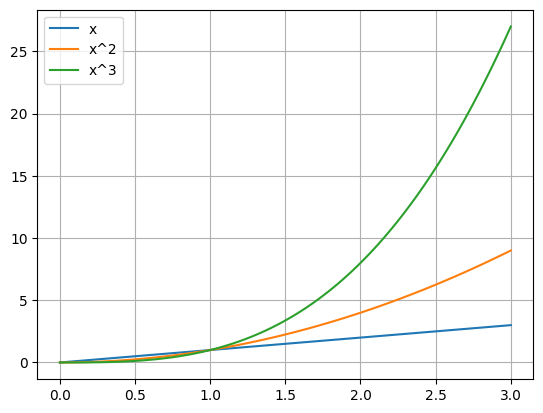
16. Subplots
A subplot places separate graphs inside one figure.
Question 18
Display \(\sin(x)\) and \(\cos(x)\) side by side.
plt.subplot(1,2,1)
plt.plot(x,np.sin(x))
plt.subplot(1,2,2)
plt.plot(x,np.cos(x))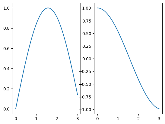
plt.subplot(2,1,1)
plt.plot(x,np.sin(x))
plt.subplot(2,1,2)
plt.plot(x,np.cos(x))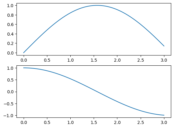
import numpy as np
x = np.linspace(0,1,100)
plt.subplot(2,2,1)
plt.plot(x,np.sin(x))
plt.subplot(2,2,3)
plt.plot(x,np.cos(x))
plt.subplot(2,2,4)
plt.plot(x,np.exp(x))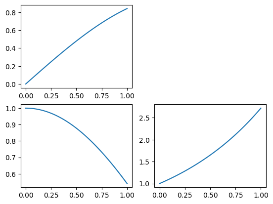
import numpy as npx = np.linspace(0,1,5)plt.subplot(6,2,1)
plt.plot(x,np.sin(x))
plt.subplot(6,2,2)
plt.scatter(x,np.cos(x))
plt.subplot(6,1,2)
plt.scatter(x,np.exp(x))
plt.subplot(6,4,12)
plt.bar(x,np.exp(-x))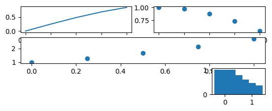
plt.subplot(1,2,1) means 1 row, 2 columns, first position.
plt.subplot(1,2,2) selects the second position.
17. Visualization for Machine Learning
ML visualizations compares actual observations with model predictions.
A useful representation is:
- actual observations → scatter points,
- predicted values → line.
Question 19
Take some actual and predicted values, display both on the same graph.
exact_tempurature = [40,42,43,44,45,46,44]
pred_temputure = [39, 44, 50, 50, 40,50,44]
plt.plot(exact_tempurature, label = "Exact")
plt.plot(pred_temputure, label = "Pred")
plt.legend()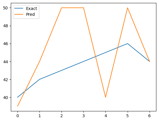
Assignment 68 - Visualization for ML
Given:
x = [1, 2, 3, 4, 5]
y = [3, 5, 7, 9, 11]
y_pred = [2.8, 5.1, 7.2, 8.9, 11.1]- Plot actual observations using scatter.
- Plot predicted values as a line.
- Display both on the same graph.
- Add a legend.
- Explain what a good prediction should look like.
# Try itExperiment and Model
time = [0, 1, 2, 3, 4, 5]
measurement = [0.2, 1.1, 4.2, 8.8, 16.3, 24.7]
prediction = [0, 1, 4, 9, 16, 25]
Question 22
Create a graph that:
- shows measurements as scatter points,
- shows predictions as a line,
- labels both axes,
- adds the title
"Experiment and Model", - adds a legend,
- adds grid lines.
Then decide whether the model appears to represent the data reasonably well.
# Try itimport matplotlib.pyplot as plt
plt.plot(x, y)
plt.scatter(x, y)
plt.bar(categories, values)
plt.barh(categories, values)
plt.hist(data, bins=5)
plt.xlabel("...")
plt.ylabel("...")
plt.title("...")
plt.legend()
plt.grid(True)
plt.subplot(rows, columns, position)
plt.show()